While designing an eCommerce website, you must keep both design and user experience in mind. To increase conversion, you cannot but follow several design best practices.
So what are these best practices? In this article, we have rounded up the top 5 web design tips that will guide you through the path of creating a top-notch eCommerce website.
1. Create an Effective Search Bar
Users are the prime concern for every kind of website; especially when it comes to eCommerce sites. This is because users need to directly act on your site to be converted.
Would customers engage that much with your site if it is not friendly? No, right?
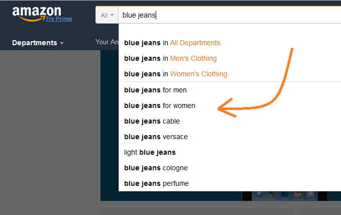
So, try creating a great user experience. One such tool that paves the way towards it is including a search bar to your website; preferably on top, in size, and color that is easily noticeable.
Your search bar should be healthy functioning and return related results in case of “no exact match found.” Users don’t like to have "no result" after they search for something.
Here is an example of an effective search function:

2. Keep Filtering Option
Have a filtering option for products on your site so that customers can directly put their desired values and find the best-suited results without having to search the entire site.
A user wouldn’t like to browse throughout the site for the desired product and find nothing at the end. If you create a filtering option and there’s nothing similar, the user sees it right away.
So, include popular and related search filters for all kinds of products.
3. Pay Attention to the Shopping Cart and Checkout Process
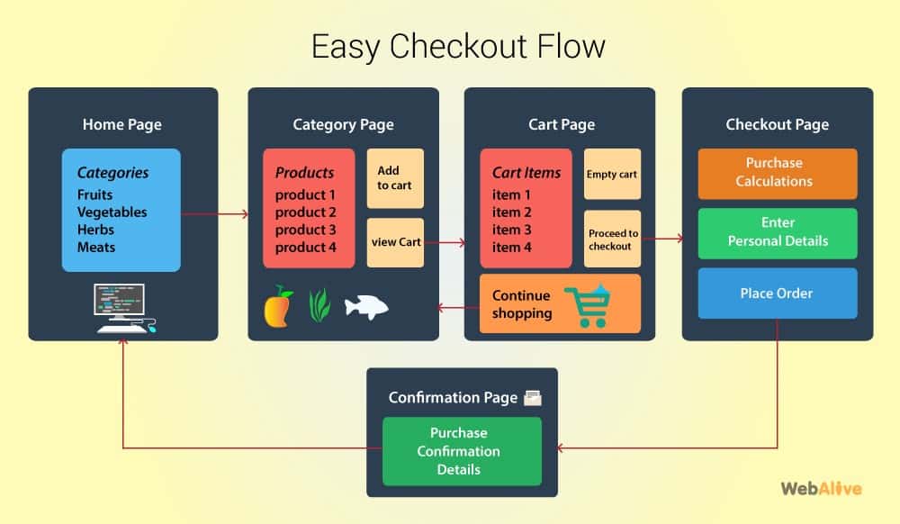
Keep a view cart option available all the time for customers so that they can edit or review anytime they wish to in their orders.
Show the shipping fee while customers put the products into the cart. Customers hate to find the additional shipping cost at the end and may abandon the cart.
Make the checkout process easy and straightforward. Customers must not find it complicated to check out. Keep it simple. Take the necessary information only while checking out.
Keep guest purchasing available. It is not recommended to force the users to sign up just before they check out.

Image source: WebAlive
You May Like: How to Start an Ecommerce Business
4. Mobile-friendliness is a Must
Your site must be mobile-friendly. Most of the users now use their handheld smart devices to surf the internet and accomplish their tasks. Having a mobile-friendly website is also good for ranking. Google now indexes and ranks websites based on their mobile versions.
Purchasing products from eCommerce sites are no different. You will lose a massive amount of customers if you do not have a mobile-friendly version of your site or customers can’t use it.
5. Keep things Simple and Transparent
Till now we have mostly discussed aspects that take care of user experience. And that should be your main focus for creating a conversion-friendly website.
Navigation should be easier. Make a design that reflects a perfect combination of whitespaces, visuals, CTAs, etc.
Create FAQ pages and keep the payment methods clear. These create a sense of transparency among the users.
Try getting reviews from the customers by asking for it from them. They are likely to give you feedback. This helps other users judge the products and the shop.
Conclusion
The eCommerce design tips mentioned above can quickly turn your online store into a high performing one. Once you have implemented them, go for more. Keep the user experience your topmost priority. You most definitely will have the expected results.


